Your Ally in Amazing.
The Exhibit House rebrand
With over four decades in business and only one major rebrand, The Exhibit House was over due for another one. The process began by understanding a few items... the company's history, team dynamics, strengths, opportunities, reputation, competition, and vision.
The organization of this information would give way to a clear framework from which refreshed core values, differentiators, a mission statement, messaging, and finally a identity system were born.
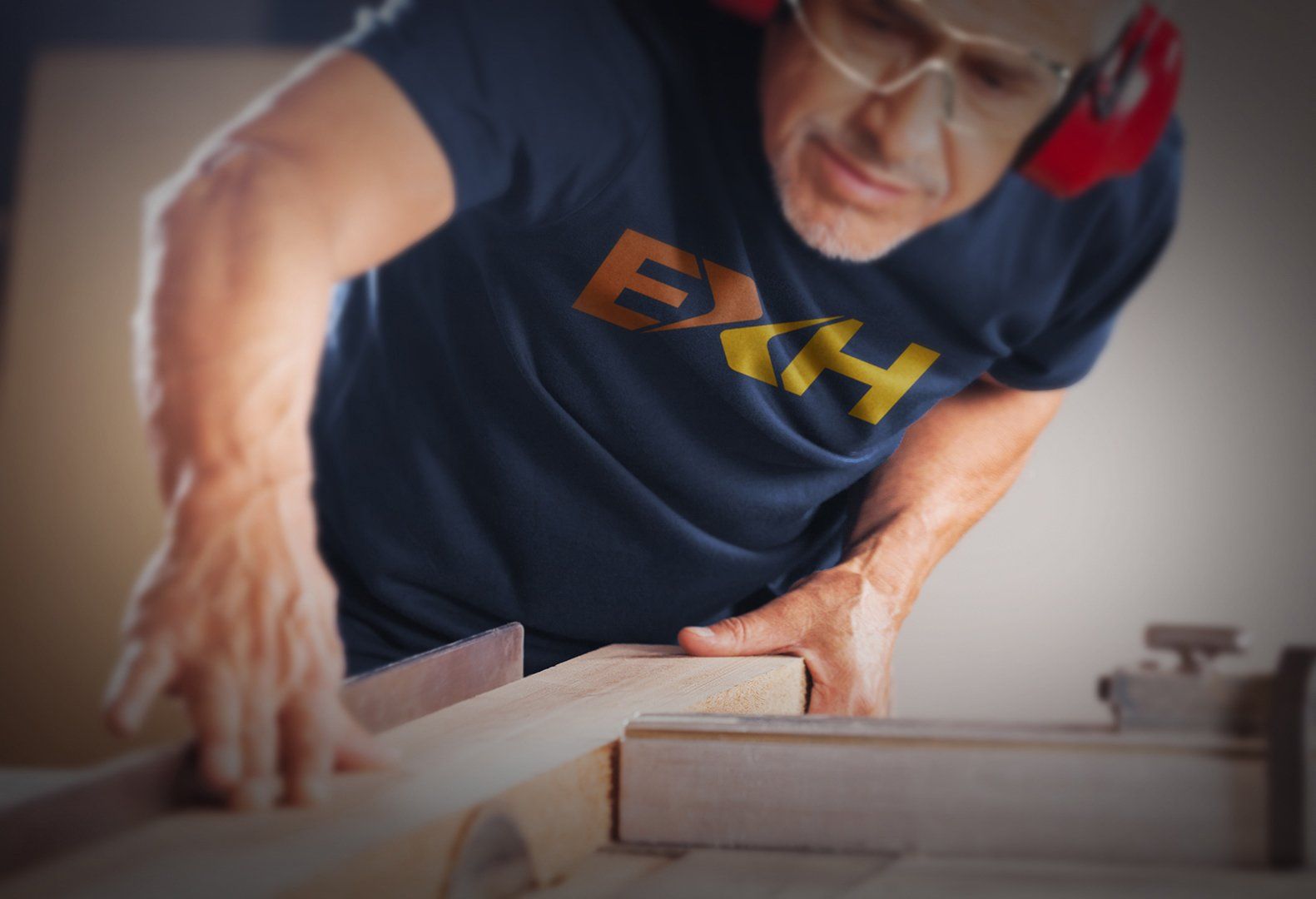
For the logo refresh, our goal was to develop a mark that could offer flexibility in its use while subtly hinting at what it is The Exhibit House provides; branded fabrication at the intersection of strategy and creativity. The X is divided into halves, each one postured toward one another to represent the complimenting strategic and creative qualities, while on another level the two converging halves come together to form a pair of angles walls, hinting at their fabrication and production capabilities.
CLIENT
The Exhibit House
LOCATION
Indianapolis, IN
SECTOR
Event Design & Management
SERVICES
brand development
graphic design
old / new logos